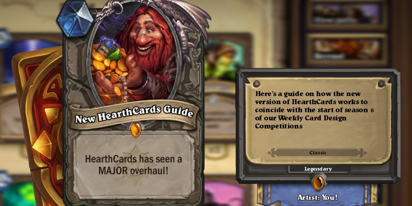
We've started a new season of our Hearthstone WCDCs. If you competed in our prologue competition, you surely noticed that HearthCards is not quite what it used to be. In-between the end of season 5 and the start of season 6 is when HearthCards received a huge update. It's been around for a couple of months, but many participants on our site are likely only realizing it now and there's a lot of changes to discuss. To coincide with the beginning of the first competition of season 6 is this little guide to show you around the new version of the site.
Note that this guide will assume that you already know how to use HearthCards. If you don't know how to use it, you can check out my old guides for it from years ago that teaches how to use the old version of the site (Guide 1) (Guide 2). Many of the same principles still apply.
Table of Contents

This is our canvas for the new version of the site. It's relatively similar to what we're used to on the old version of the site, but it has some important differences. Along the left is the list of card types as always, however take note of the fact that this version of HearthCards does not use the old Locations (from before locations were actually implemented into the game), Boss Card, or Backpack card designs. It also does not currently support Mercenaries cards at the time of writing, so if you're desperate to get into making Mercenaries, you'll have to keep using the old version of the site.
[cards]

This area has been moved around a bit where the class options are now above the name and type fields as opposed to below them. All the options still remain the same though. The way dual-class cards work is a bit different. It will take whatever your currently selected class is, and then when you select a new class, that new class will just occupy the right side of the card. Only the classes in the game can be chosen in this field, and therefore, it's impossible to make a dual-class card of two custom classes (unless you have good image editing abilities).


In the type bar, you can now give minions two different minion types by separating them with a comma and a space. At the moment, this only works on minions.

This area of typing the card's Cost and stats remains the same, but there's one big addition, and one that may not be as obvious, which is the fact that you can click on the Mana Crystal icon to get a whole range of extra options.

From here, you'll be able to select if your card uses Mana Crystals as normal, or you can choose a Battlegrounds tier and Gold icon if you're making a card for that mode. Here, you can also apply a Tradeable banner to it (just remember to also type it on the card). You can also choose to give the card a Runestone cost if you want to make the game really pay to win. Interestingly, it also uses the old Runestone icon from before the currency was internationally available.

From here is also where you can apply Runes to your card. Simply choose a Rune type and an amount and it will apply that many Runes of that type to the card. It is not possible to apply more than one Rune type to the same card without image editing magic. You can apply Runes to anything like this...

... but you really should only use them on Death Knight cards.

Here is the area where you apply your card's rarity, watermark, and dragon border. The swirl icon applies the watermark the card and the dragon icon applies the dragon border to it, and you can toggle these on or off by clicking them. By default, the swirl icon will be on and the dragon icon will be off. If you make the card Legendary, the dragon border will automatically turn itself on and if you change it to a different rarity, it will turn itself off again, but it be applied or unapplied at will. If you choose for the card to have no gem, the swill icon will automatically turn itself off, but you can turn it on again.

This area is where you apply your card text. You can click the B button to turn on bold BBCode to bold your text (if you write a keyword, it will automatically bold itself) or the I button to italicize it. You can also click the bottom-right corner of the text field to change its size and drag it, although this shouldn't be necessary as the default size should work fine for basically any design. You may notice the lack of P button, and that's because the updated version of HearthCards automatically updates the card in real time.
The number 53 represents the font size. By default, this number is 53, but it will change by itself if you write a text that's too long for the card to use with that size. You can also manually change the text size yourself with the + and - buttons which will sometimes come in useful for formatting. If your card is just a hair too long to fit in 3 lines of text, simply reducing the text size can make it fit and look much more elegant. The font size number can be any number in-between 43 and 56.

Additionally, because the system happens to have hippopotomonstrosesquippedaliophobia (a fear of really long words, ironic I know), it will not attempt to implement a word onto your card that is too long to fit on one line. Not that you should happen to encounter this anyway.

Next to the text field is where you choose the card's watermark and card style. Card style refers to the card being able normal, Golden, Diamond, or using the March of the Lich King Signature look as follows:


A few things to note is that Diamond cards do not support dual-tribes or custom classes and also have less text space than Regular, Golden, or Signature cards. Signature cards also do not support any classes (meaning that they must all be tagged as Neutral) or tribes.

At the top of the list of cards, you'll see a cog with "CUSTOM" written below it. While it may not be immediate at first glance, this is actually a button. Clicking on it opens up this:

From here, there are multiple different options of custom choices for borders, watermarks, and even artwork. There all also buttons labeled "All", "My", and "Liked" that you can sort watermarks by.

Here is where you can choose a custom class border. The list of pickings is severely truncated compared to old HearthCards, featuring only 10 borders to choose from as opposed to old HearhCards which featured 26 (or 31 if you count each alternate color options as separate borders) and only the default color options for Dragonsworn and Weaver are in the new HearthCards. One upside though is that every border supports both hero cards and locations, even the ones that didn't in old HearthCards that returned in the new HearthCards.

This area is where you choose a custom watermark for your card, and there are more than 150 of them to choose! Additionally, at the very bottom of the list are mini-set watermarks for every set from Curse of Naxxramas up to Saviors of Uldum and also ones for Ashes of Outland and Scholomance Academy. Each watermark has a star next to the name which can you click on to "Like" that watermark and store it in your "Liked" tab.
One improvement on new HearthCards is that all custom watermarks will properly display on the card canvas. The custom watermark codes used on old HearthCards however will not work here. You'll also be able to make your own, but we'll get to that a little bit later.

You have a choice of two custom card types. The second one is the Backpack which was featured on the old HearthCards and you're likely familiar with it already. The first one are Fatigue cards which are exclusive to the new version of HearthCards and allow you to create your own card types using the border of the Fatigue cards you see when you draw from an empty deck.
If you're wondering why we're skipping custom banners, it's because at the time of writing this... there aren't any.

From here, you have a list of AI-generated art. AI-generated art is a bit of a controversial topic in modern times and it fully makes sense why. Thankfully, the collection of AI-generated art in HearthCards is one of the times where that isn't a problem and nobody can get mad about it. The usage of this feature is a bit situational, but should the situation call for it, then all of your art finding problems are not a thing. To use one of the AI arts, just click on the art you want to use and the system will automatically apply it to the card.

The Create button at the bottom of the list is actually its own option and takes you to a page where you can create your own watermarks. The system gives you some tips on how to make a good watermark. Not everything will work well. Especially things that have thin lines on them, so avoid having them in your custom watermark. Make sure you also pick something with a transparent background. Ideally, the file you use should also be at least roughly square.

After you finish creating your card and you clicked "Create", you'll arrive over here. You can download a full-size card, which is almost double the default size of cards from old-HearthCards (you will never want to post a card on this website that is that big). You can also download a half-sized card to save on storage space.
You cannot directly right-click the card and copy the image like you could with old HearthCards. Instead, the only way to post a card you made from old HearthCards without downloading it is to use the HearthCards link which will expire after a few days. In some areas (Discord for example), it is possible to post a card you made without downloading it and without fear of it expiring by highlighting the HearthCards link, opening it in a new tab, and then right-clicking the image where you will have the normal options from there.
You can click on "Make Another Card" to immediately make a new card from scratch. A significant feature of the new HearthCards is the "Back to Editing" button. If you notice a mistake on your card, you no longer need to copy the card's 8-digit code and Import it to regain all of your progress. Instead just click that button to go back to the canvas and make your corrections.
Comments
No Comments Yet. Be the first to create one down below!